UI/UX
REBRAND
10/2026
MYVISION SOFTWARE
They asked for a website. They needed a direction.
About the company
Since 1999, myvision Software GmbH has been developing tailored ERP and business management solutions. Based on each client's specific requirements, the team advises on and delivers Business Central extensions, custom development and interfaces for reliable data integration and migration. At its core is a best-of-breed and open-source approach: combining the most suitable tools instead of relying on a single system.
What looked like the problem
The brief was simple: keep the website's structure, give it a modern look. A visual refresh for a company that had been doing excellent work for over two decades. But our first conversations raised a question no new color palette could answer: what exactly should this website say?
What was actually wrong
Myvision had grown faster than its own story. The expertise and services were all there, but they lived in people's heads rather than in a shared language. A new layout would only have made the gaps look tidier. So instead of opening Figma, we started with a two-day workshop. Together with the team, we defined positioning, target groups and what truly sets myvision apart. We came out understanding the business in detail, and the team came out with a clearer vision of itself.
A new point of view
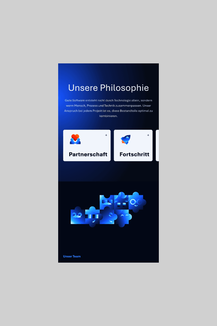
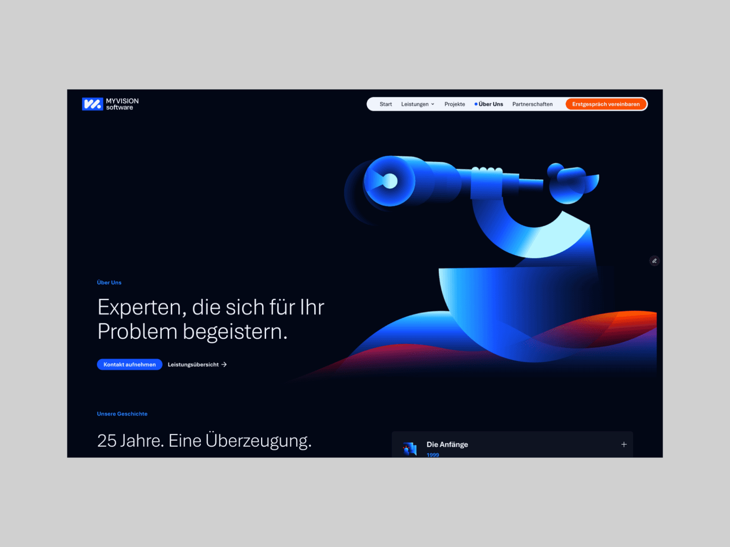
Positioning first, design second. The result is a cohesive brand for an established IT company, technically strong and human in tone. myvision connects systems into a coherent whole, and now its brand does the same, linking services, values and people into one clear story. Logo, colors, icons and illustrations follow that logic across the website, pitch decks and social media. And the website got a new structure after all, because the content finally had one.